Apple on the other hand have managed to introduce 10.000 applications through AppStore in a relatively short time. If I remember correctly AppStore was opened on around June 2008 which means 10.000 applications in less than 6 months. 148apps.com have created a tribute page which shows all the applications available in AppStore.
I listed some of the good, bad and ugly in Apple's and Nokia's way of offering applications and installing them. After these lists, there are multiple screenshots illustrating the user experience of finding and installing an application.
AppStore
The good (positive):
- Offers wide range of applications.
- Search works really well. This is important when you have lots of applications.
- Fast. iPhone doesn't ask too many questions when using AppStore.
- Really easy to use. Just browse to an application that you like, click install and installation process starts.
- Updates. AppStore informs the user about possible updates.
- Easy payment process. Uses iTunes payment methods.
The bad (negative):
- The only place for finding applications.
- Applications don't have a test period, at least I haven't noticed this.
- iTunes id is needed for installing even free applications.
- iTunes is the only payment method.
The ugly (improvements and thoughts):
- Suggestions. AppStore could suggest applications that other users have installed, just like e.g. Amazon.com. AppStore through iTunes does this.
- What happens to compatibility if Apple introduces more devices?
Download!
The good (positive):
- Not the only place for finding applications because you can find applications anywhere from the Internet.
- Most of the applications offer trial period possibilities.
- You can use any credit card for paying.
The bad (negative):
- Only limited number of applications.
- Search doesn't work well enough.
- Somebody can find it difficult to use because device asks quite many questions, e.g. used internet connection and where to install the application.
- Relatively slow when updating content in different folders.
The ugly (improvements and thoughts):
- Usability should be much better.
- Updating different folders should be more seamless, not asking question from the user all the time.
- Number of available applications should be much higher.
Screenshots of installing an application from the AppStore:

1. You can find AppStore from the main menu. AppStore also informs the user about possible updates (red 1 in AppStore's top-right corner).

2. AppStore advertises recent applications.

3. Applications are divided to Paid and Free sections.

4. There is also an application Top list.

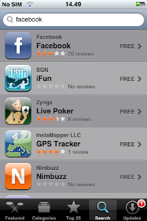
5. Searching for Facebook application.

6. Search results.

7. More information about the application.

8. Free button toggles to Install button when you press it. After pressing Install, the installation starts.

9. You need to use iTunes' credentials to be able to install applications.

10. Installation process ongoing.

11. Installation finished. You can find installed application from the main menu.
Screenshots of installing an application from Download!:

1. You'll find Download! from the main menu.

2. Download! asks used connection really often, although phone should be able to choose desired connection.

3. Search possibilities after choosing Options - Search and about to search Facebook -application.

4. One search result but it is not shown on the first page.

5. You have to scroll down to see all the results.

6. The search result.

7. After choosing Details - Get, phone shows information about the application.

8. Choosing where to install the application.

9. After installation application can be found from Applications folder.

10. Most of the applications have trial possibilities like ForecaWeather.

11. You can also use multiple credit cards for paying.


